


|
|
|
|
|
Here are some quick tips to get started making informative and
delightful blips and bleeps with playitbyr. If
you're having trouble and want to request help, report a bug, or
browse the documentation, see the Support
page.
sonify Objects
First, install Csound and the csound package. Some installation help and download links are available here. Then, you can install playitbyr from CRAN:
install.packages("playitbyr")
When you plot a visual graph, you specify what visual
parameters you want to represent the parameters in the
data. Audio graphs are the same idea, only you specify the
sonic parameters instead. In fact, the syntax closely
matches that
of ggplot2,
a popular plotting package.
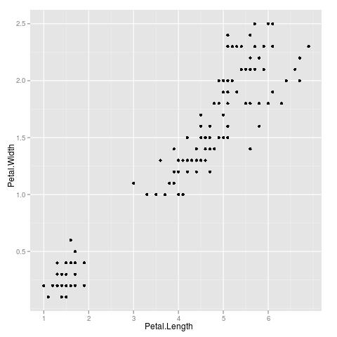
Here's the code for a simple scatterplot
in ggplot2 of iris measurements:
ggplot(iris, aes(x = Petal.Length, y = Petal.Width)) + geom_point()
This produces this graph:
Now, here's an audio graph of the same data
using playitbyr.
sonify(iris, sonaes(time = Petal.Length, pitch = Petal.Width)) + shape_scatter()
The first argument is the data.frame to be
sonified and the second argument is the desired mappings of
sound parameters to data
parameters. Here, Petal.Length is mapped to
time and Petal.Width is mapped to pitch. Both the sonification and visualization suffer from overplotting: it's hard to get a good sense of the data because multiple points overlap in pitch and time in the output. We can hear some of this by using the jitter parameter on shape_scatter:
sonify(iris, sonaes(time = Petal.Length, pitch = Petal.Width)) + shape_scatter(jitter = 0.3)
Back to top
The
You can look at the summary of a
We see a lot of default values that we did not manually set. For
instance, the time range of the sonification is set to 0 through 5
seconds, and the pitch between what
If we want to change the time and pitch ranges, we can add on the appropriate
To save to an external file, you can use
Faceting splits a dataset by a variable, and then creates separate sonifications for each subset of the data, playing them one after another. You can facet by a categorical variable, using
Back to top
This example is a bit more complicated. The data is from 1974 Motor Trend car road test data, which shows the size of the engine by cubic inch displacement (
To construct this, we use our sorted data as the first argument of
Back to top
This design can be used effectively in combination with
The design of Tweaking and Interacting with
sonify Objectssonify function creates an object
of class "sonify" that you can assign to an object:
x <- sonify(iris, sonaes(time = Petal.Length, pitch = Petal.Width)) + shape_scatter()
sonify object:
> summary(x)
data: Sepal.Length, Sepal.Width, Petal.Length, Petal.Width, Species
[150x5]
mapping:  time = Petal.Length, pitch = Petal.Width
faceting: NULL
-----------------------------------
shape_scatter:  jitter = 0, relative = TRUE
-----------------------------------
minimum and maximum values of shape parameters:

Min   Max
time     0.00   5.0
pitch    8.00   9.0
dur      0.25   4.0
vol      0.20   1.0
pan      0.00   1.0
tempo  120.00 240.0
attkp    0.01   0.3
decayp   0.01   0.3
mod      0.80   5.0
indx     0.01   0.3
playitbyr calls 8, or
middle C, and 9, an octave above (this is
Csound's 'oct'
notation). These defaults and parameters are documented in more
detail in the help page for and shape_scatter.
scale_ functions. Here, we're changing the time range to be from 0 to 10 seconds, so the sonification is twice as long; and the pitches to span a 5-octave range (rather than the 1 octave it spans by default).
x + scale_time_continuous(c(0, 10)) + scale_pitch_continuous(c(7, 12))
sonsave:
sonsave(x, "myfile.wav") # Windows and Linux

sonsave(x, "myfile.aiff") # OS X sonfacet() to segment your data by that. Here we facet by iris species:
sonify(iris, sonaes(time = Sepal.Width, pitch = Sepal.Length)) + shape_scatter() + sonfacet(Species)
shape_scatter creates one layer of the sonification, but we don't have to stop there. We can bring in different layers to show different data concurrently or to provide different textures. We can specify the data, mappings, and settings of each layer separately.
sonify(mtcars[order(mtcars$disp),]) + shape_scatter(mapping = sonaes(tempo = disp), pan = 1) +

shape_dotplot(mapping = sonaes(tempo = mpg), pan = 0) + scale_tempo_continuous(c(60, 400))disp) and the fuel efficiency in miles per gallon (mpg). The left speaker represents the displacement by tempo, where a faster tempo is a higher displacement, and the right speaker represents the fuel efficiency, also by tempo; the overall dataset is ordered from least displacement to greater displacement, and we can hear that the two go opposite directions.
sonify, and add on two layers to achieve this effect. Note that we need to specify the mappings separately for each layer since they are using different mappings from each other.
playitbyr 0.2-0 introduces two special layers, shape_histogram and shape_boxplot.
shape_histogram provides a sense of the distribution of a variable by representing the value of the variable by pitch and taking repeated samples (with replacement). The sonification can be as long as you want it to be: playitbyr can keep on taking samples indefinitely.
sonfacet to compare different values of a categorical variable. For instance, we can listen to Sepal.Length, faceted by the three different iris species (setosa, versicolor, and virginica):
    sonify(iris, sonaes(pitch = Sepal.Length)) + sonfacet(Species) +

	  +    shape_histogram(length = 3, tempo = 1800)
shape_boxplot is a similar principle. The same sampling occurs, only now there are three phases: first, the entire range of the data, then only from the interquartile range (the 25th to 75th percentile), and finally just the median. This can help give ideas of both center and spread for a variable. We'll again look at Sepal.Length and facet by species here:
   sonify(iris, sonaes(pitch = Sepal.Length)) + sonfacet(Species) +

shape_boxplot(length = 1, tempo = 1800)shape_histogram and shape_boxplot is based on Chapter 8 of the new and freely available Sonification Handbook.